
This is Part 4 of my 5 part series sharing my 24 hour #StartupThisSunday cross Asia adventure building the human powered website monitoring service wpFlight.
In Part 1, Part 2 and Part 3 we got off to a great start creating wpFlight. We rejoin the story at Singapore's Changi Airport parked at gate B8 just prior to takeoff.
June 15, 2015 - 6:00am: Goodbye Singapore!
I find early morning flights when I’ve already been traveling for hours fascinating. They throw together a people with a bunch of different perceptions of reality in a tin can and do so in a way that makes it incredibly obvious. As the person who has been on the road for hours, I usually want to get a bit of sleep. Today, it was no different. I was too tired to be very productive in the 45 minutes between the time I boarded and when breakfast would be served, so why not try to get some shut eye. In my reality, I’d been awake twenty hours, so now was time for quite and sleep.
The woman seated next to me was asleep when I arrived and didn’t so much as move until the flight attendant woke her up for breakfast. In her perception of reality, 6am Singapore time was clearly a time to be asleep. One row ahead, was a woman from whose accent I can only assume must be from Texas was very excited about being a morning person. In the reality she perceived, 6am was already well into her day, so she was talking loudly and excitedly about interesting things she’d noticed during her stay in Singapore to her neighbor. Much to the dismay of fellow travelers trying to sleep, she would also periodically open her shades to catch a peak of the rising sun allowing piercing sunbeams to spill into the eggshell white cabin.
Needless to say, I wasn’t that successful in getting any proper sleep. I did, however, spend some time relaxing while listening to music and realized that Apple Watch is very useful as remote control for the music on your phone when you’re stuck in an economy class seat.[1]
After United’s surprisingly pleasant flight attendants served something called “breakfast” but seemingly bearing no relationship to the word, I was ready to get back to work. I had copy to write and a logo to create. Since the logo was a discrete project that that involved creating one thing, I decided to tackle that first before working more on potentially endless copy writing.
7:00am: Creating a logo
As I've mentioned earlier in our adventure, artistic design isn’t my strength. In the past, I’ve always had other people create my brand’s logo whether it be my co-founder or a staff designer. There are lots of great service like 99designs that help you get something that looks good for a reasonable price. The problem is all of these methods take time. Even 99design’s ready made logos take at least 24 hours to be customized. Time isn’t something I had…I needed to launch by 4pm.
I had a couple of goals in creating the logo:
- Simple: Anything complicated would take too long and make my the limitations of my artistic ability painfully obvious.
- Scalable: It needed to look good at small and large sizes and both regular and high density Retina screens.
- Logo & Text: I wanted a logo and text that could be either used together or separately.
- Good enough: I wanted something that is good enough to launch with my MVP. It’s always possible to have a professionally designed logo created later.
The obvious logo for a name like wpFlight is an airplane…obvious both because of the word “flight” in the name and the fact I was making a logo on an airplane. Time and energy was running low, so I decided to go with the obvious.
Next I had to figure out how to draw an airplane or come up with an airplane image I could use. Drawing an airplane wasn’t going to happen but I remembered that the Unicode character standard that all modern devices use to represent characters in different languages has a few airplane characters.
Unicode has at least two airplanes - there’s a solid color airplane character number #2708 and the emoji airplane. The emoji airplane is always represented by the built in emoji font, but changing fonts between different unicode fonts lets you change the shape of the solid airplane. I played around and decided that Arial’s airplane looked best - sleek and with out engine pods.
The next step was to fire up my favorite vector graphics program, Inkscape. It’s less complicated to use than Adobe Illustrator and also free and open source.
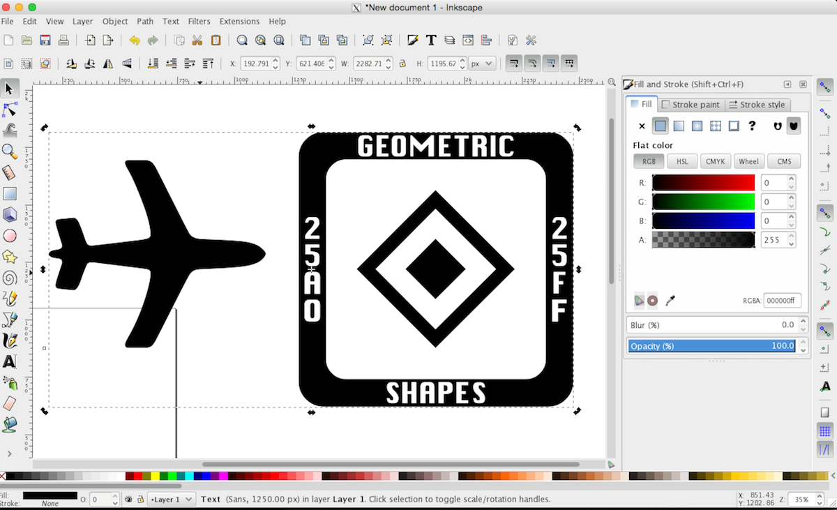
I rotated the airplane so that it’s pointing to the right and up sort like a rocket to represent my hope that we will help customer’s businesses will move forward and reach new heights.
I originally planned to write wpFlight with the first three letters capitalized. However, this combined with an airplane made the left side appear too cluttered and heavy. It was at this point that I decided to write the “wp” in “wpFlight” in lowercase and capitalize the “F” in the word “flight.” This improved the balance situation and made it easier to read.
Next, I spent about 15 minutes trying out different fonts for the logo.
I had selected Oxygen earlier as our font for the site copy and headlines, so I wanted to pick something that looked good both with that and the airplane logo. Oxygen is a modern looking sans-serif font without the little “feet” that come with a serif font like Times New Roman. My first thought was to try using Oxygen for the text in the logo.
This didn’t look that bad, except for the fact that it didn’t look very “logoy” - it looked like I had typed some words next to an airplane.
I fired up Mac OS X’s excellent Font Book app and spent some time browsing through the few hundred other options I had. I narrowed it down to a few sans-serif fonts and one serif font, American Typewriter.
I liked the font Futura the most. I particularly liked the way the it appears square and conformist on first glance, but on closer inspection it becomes apparent that the font is subtly rebellious. The center tip of the “w” is higher than the left and right sides of the character in stark contrast to typical fonts where all three tips are the same height or the left and the right are higher. To me this font said we’re business-like yet do things differently and stand out in the crowd.
Once I selected the font, I tweaked the airplane size and alignment. Originally I had rotated the airplane at a 45 degree angle, but now I adjusted it so that the plane’s starboard wing (pretend we’re looking at the plan from above) was parallel with the slope of the “w”.
When I was happy with my results, I was ready to create the Scalable Vector Graphics (SVG) files we’d use in the final site. To do this, I converted the text and the airplane from characters to paths. This would store the shape of the words and plane in the file and ensure that it would look exactly as I intended even if a visitor to wpFlight doesn’t have the Futura or Arial fonts installed on her computer. Finally, I exported all black and all white versions of the logo in plain svg format.
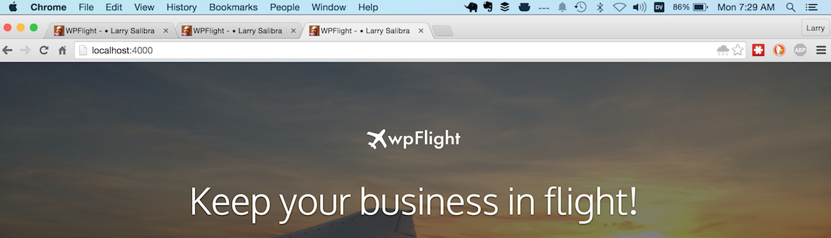
90 minutes into the more than 3 hour flight back to Hong Kong, I was ready to add the logo and graphics to the top of the site. I first picked a great picture I had taken on a previous flight of the sun rising in the distance with the airliner’s wing in the foreground. Next I spent some time playing around the adjusting the sizing of the logo. This turned out to take more time than I anticipated because the template I’d chosen had custom css settings know as media queries for many more browser sizes than your typical bootstrap theme.
7:40am: Copy
With about two hours remaining before landing, I could focus on figuring out the rest of the site copy, at least as much as someone who has been awake for almost 21 hours and traveling and working for 15 hours of them.
If you recall, I had already outlined the different sections of the website on a panel by panel basis:
- Interactive: Welcome banner with input box for customer website
- Static: Overview of the service
- Static: Benefits
- Static: How wpFlight delivers benefits
- Static: Description of deliverables (What the customer gets)
- Interactive: Plans + signup call to action
- Static: Contact info
I started working on the benefits panel. Originally, I wanted to focus on the benefits that wpFlight delivers customers, Instead, I decided to change the focus of this panel to the critical components of their website that deliver the most value to their business and how wpFlight can protect them. I came up with four important features of business sites in our target market and wrote copy that invited customers to think about the cost to their business if any of these stopped working without them knowing about it.
Next, I moved one panel up and wrote up a brief description of what wpFlight is for the overview panel. To accompany the overview, I selected a picture of the Singapore Changi Airport control tower I had taken a couple hours before.
Then I skipped down to the 4th panel where I described how leverage the power of a worldwide network of thousands of human testers to deliver the wpFlight service and protect their business website.
After that, it was time to explain to customers the wpFlight deliverables, or what they get when they sign up. Customers would get a weekly or month report telling them what we tested and that everything was either problem free or that problems where found. If we found problems, testers would receive a link to a detailed bug report with screenshots or videos and instruction that would allow them and their development team to quickly replicated and fix the problem. We would be using the Pay4Bugs Report system to deliver bug reports, so I was sure to include a button that I could link to a real bug report once I landed and regained Internet access.
Before I revisited the plans panel, I jumped down to the contact panel and added our support email address which I had hooked up hours earlier while I was on the bus to the airport.
8:35am: Plans revisited
Finally, I revisited the plan panel to see how I could improve copy or layout. If you recall, I had put the plans panel together on our previously flight. It was a bit rough and felt more complicated than it needed to be.
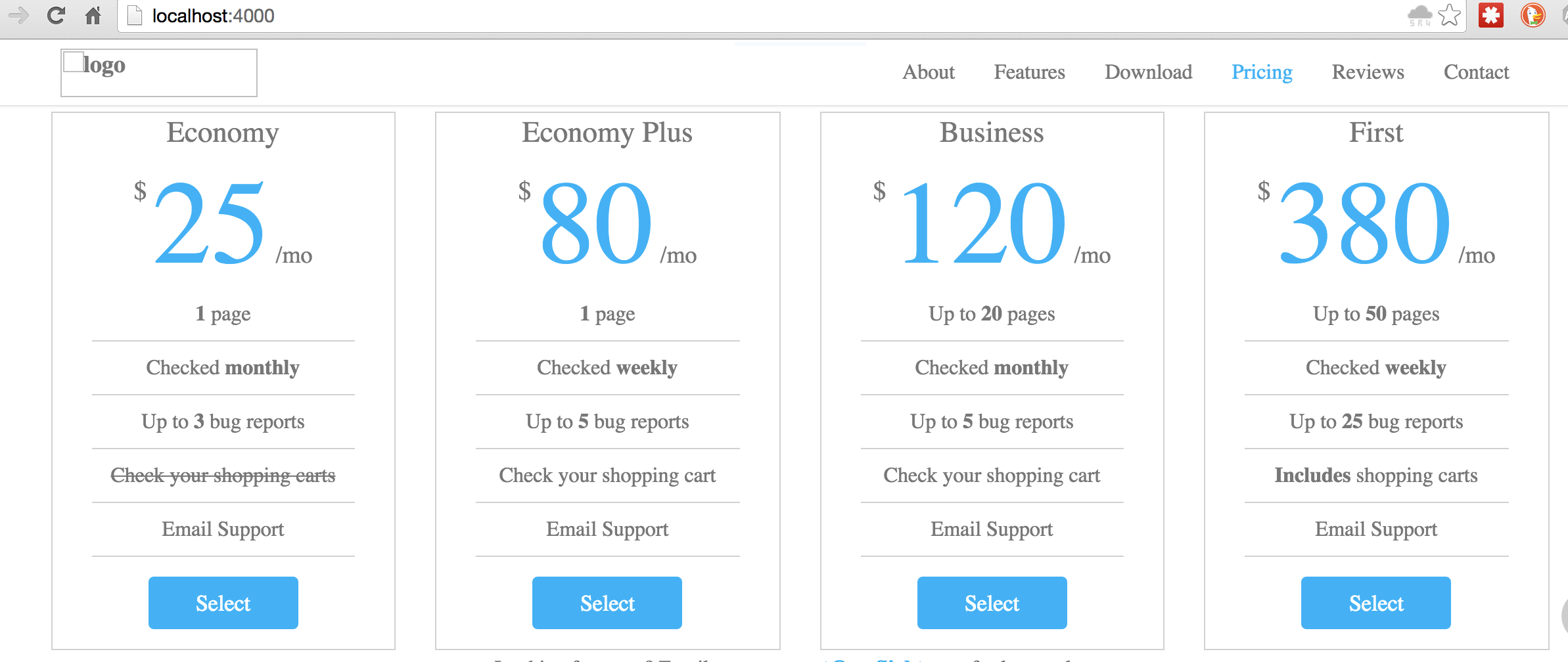
I first tried to make the differences between the plans easier to see by bolding the items that were different. I also spent some time tweaking font size and margins to make things clearer and easier to read.
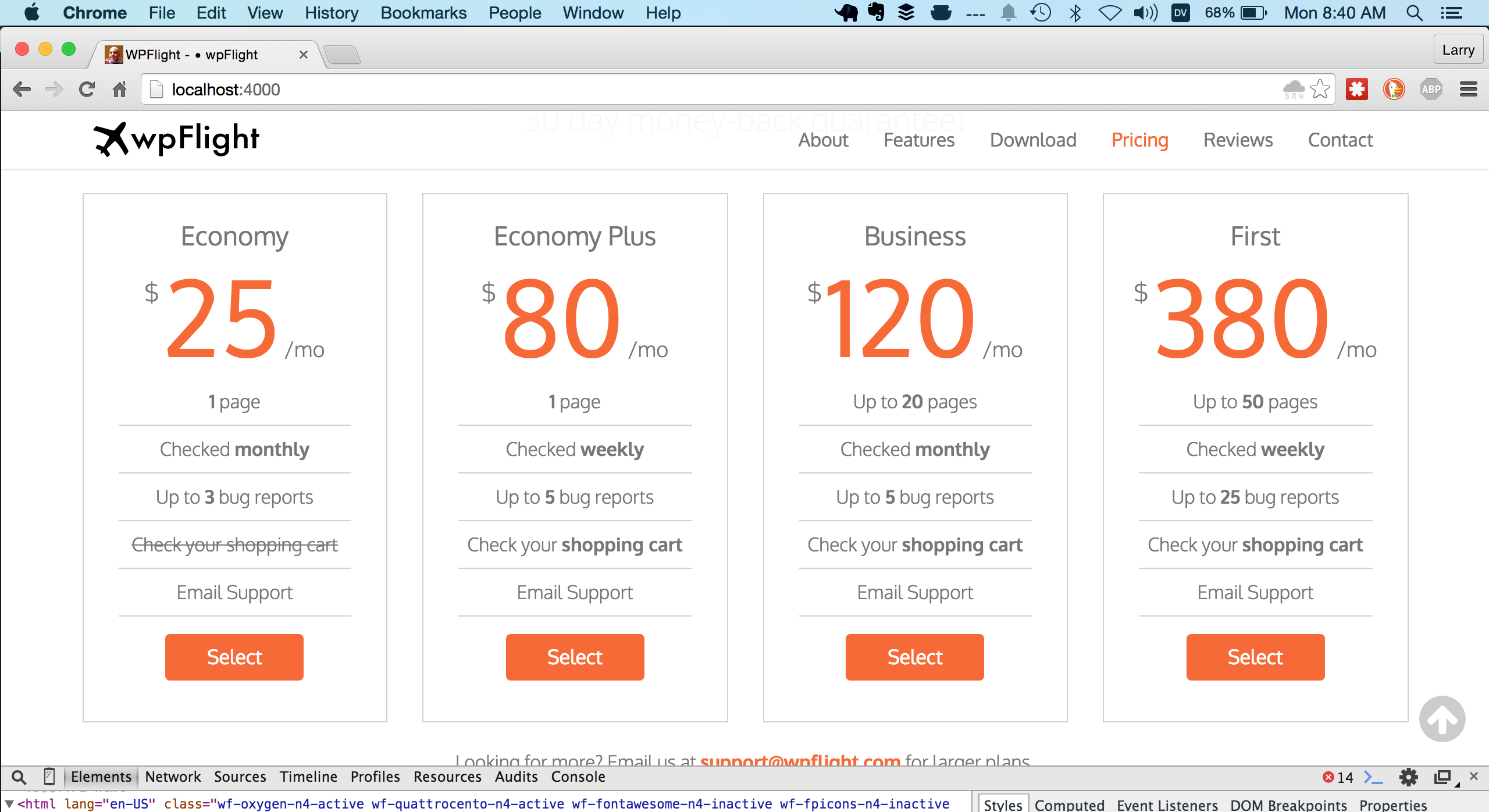
Finally, I removed the email support bullet item since it was the same between all the different plans.
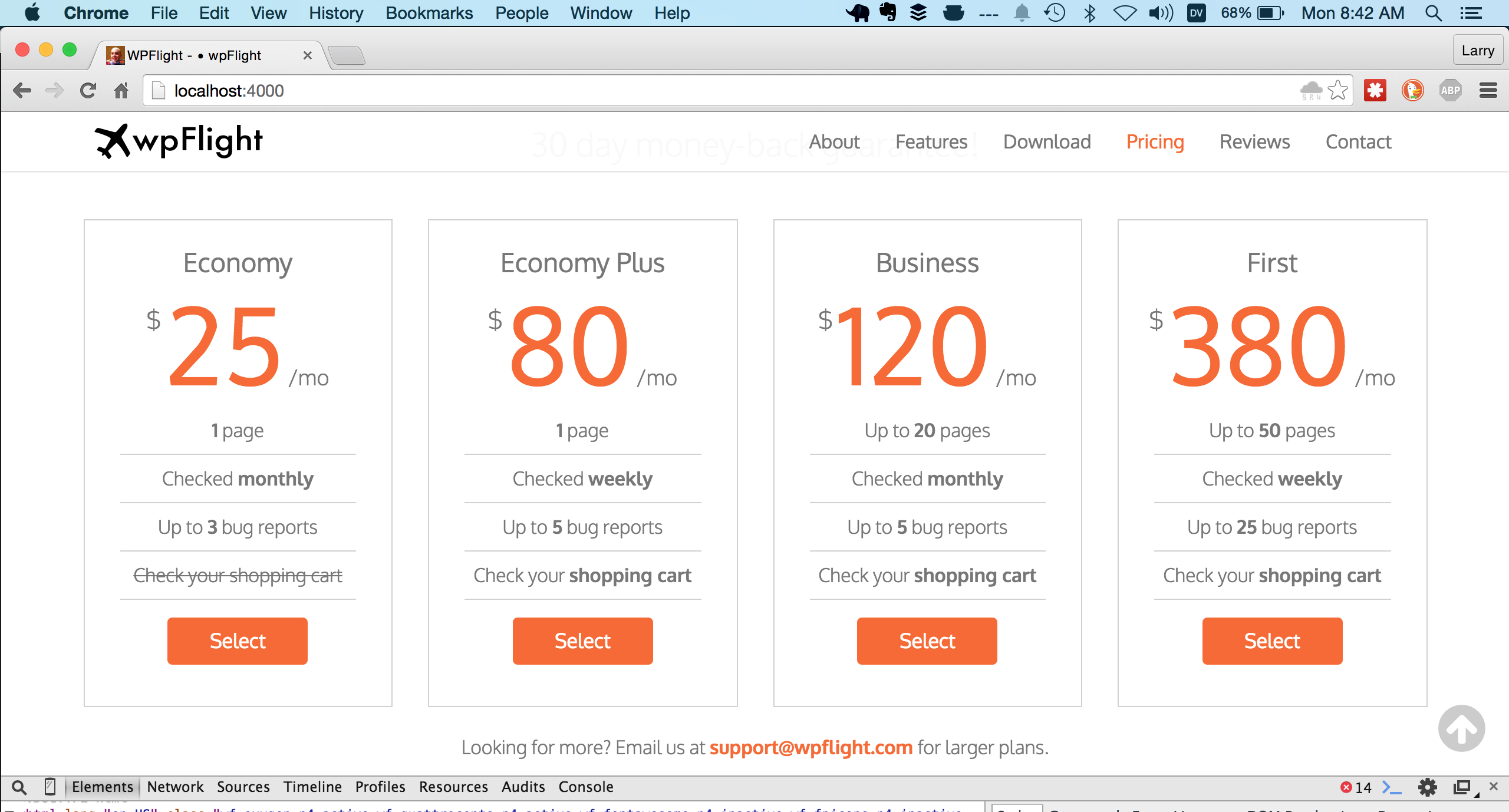
You can see from this screenshot taken at 8:42am, an hour or so before landing back in Hong Kong, that while things were starting to come together, our menu still didn’t match up with the content on the site. Besides the menu, there were I needed to spend more time adjusting layout constraints for each of the many different screen widths supported by this template, proof and edit copy, set up site header meta data, set up frontend deployment and clear up a few other loose ends before I’d be able to launch. We were scheduled to land in Hong Kong shortly before 10am, so that would give me 6 more hours before our launch deadline. But now, I was physically and mentally exhausted. It was time to try to take a nap.
Nap failure
I wasn’t very successful napping.
After thirty minutes or so, I gave up and started playing with my phone and noticed several thousand miles too late that this flight had wifi on it! I had seen the United Wifi logo on the 777 while boarding but assumed it was only available over the continental USA like it was last time I flew United. Oops. Oh well.
I closed my eyes again and listened to music, drifting in and out of something close to but not quite sleep. My mind kept going back to all the remaining items I had to finish before our launch deadline. After landing, I'd have to hit the ground running.
If you made it this far, thanks so much for joining me on Part 4 of my 5 part series sharing my 24 hour #StartupThisSunday cross Asia adventure building the website monitoring service wpFlight. Something you'd do differently? Let me know in the comments or hit me up on Twitter!
Continue reading Part 5 - The Final Stretch
Using Apple Watch to control your iPhone's music app saves you the effort of having to unbuckle your seat and do a sort of contorted hip thrust towards the seat in front of you to wiggle your phone out of your pocket each time you want to select another song. Now that’s progress! ↩︎